Hangul Sori
May 2, 2021
The Inspiration
Hangul Sori is a typeface inspired by the Korean Flag, its modular shapes, sounds, and pronunciation. This typeface system is created to portray sounds and pronunciation in a creative and inspirational way.
History of Romanization, Pronunciation, and Sounds
Romanization means writing Korean words using Roman letters or the Latin alphabet instead of Hangul, the Korean alphabet. This system is used to make the words easier to read for people who cannot read Korean.
The rules in this system can be applied to transcription, in which involves converting sounds to words, and transliteration, in which converts words from one language to another, keeping the same pronunciation.
Initial Brainstorming and Ideation
However, sometimes these Romanized words have either multiple or incorrect spellings than the actual sounds the words make, and so, to minimize these mistakes, Hangul Sori was designed to connect the Korean pronunciations to the English alphabet for easier reading. This alphabetic system consists of 26 letters from the English alphabet, and using the letter forms, the Korean characters can also be created.
The typeface uses both the Korean and English alphabets, symbolizing the connection of two languages and cultures.
Hangul [ hahng-gool ]
noun
the Korean alphabetic writing system, introduced in the 15th century, containing 14 consonants and 11 vowels.
Sori [ translation to sound ]
noun Phonetics
any set of distinctive sounds of a given language.
“Hangul is the most scientific system of writing in a general use in any country”
Creating the Typeface System
Using the modular shapes from the Korean Flag, the Hangul Sori was created, and each module has a specific role in the typeface. Black lines, size, and shape from the flag are used to create the letter forms of the alphabet. Upon formation, the bowl of the letters is used within the spaces between each characters to symbolize the sound and pronunciation.
Both the English and Korean alphabet can be created with the modules, and furthermore, the purpose becomes more evident within the typeface.
Crafting and Execution
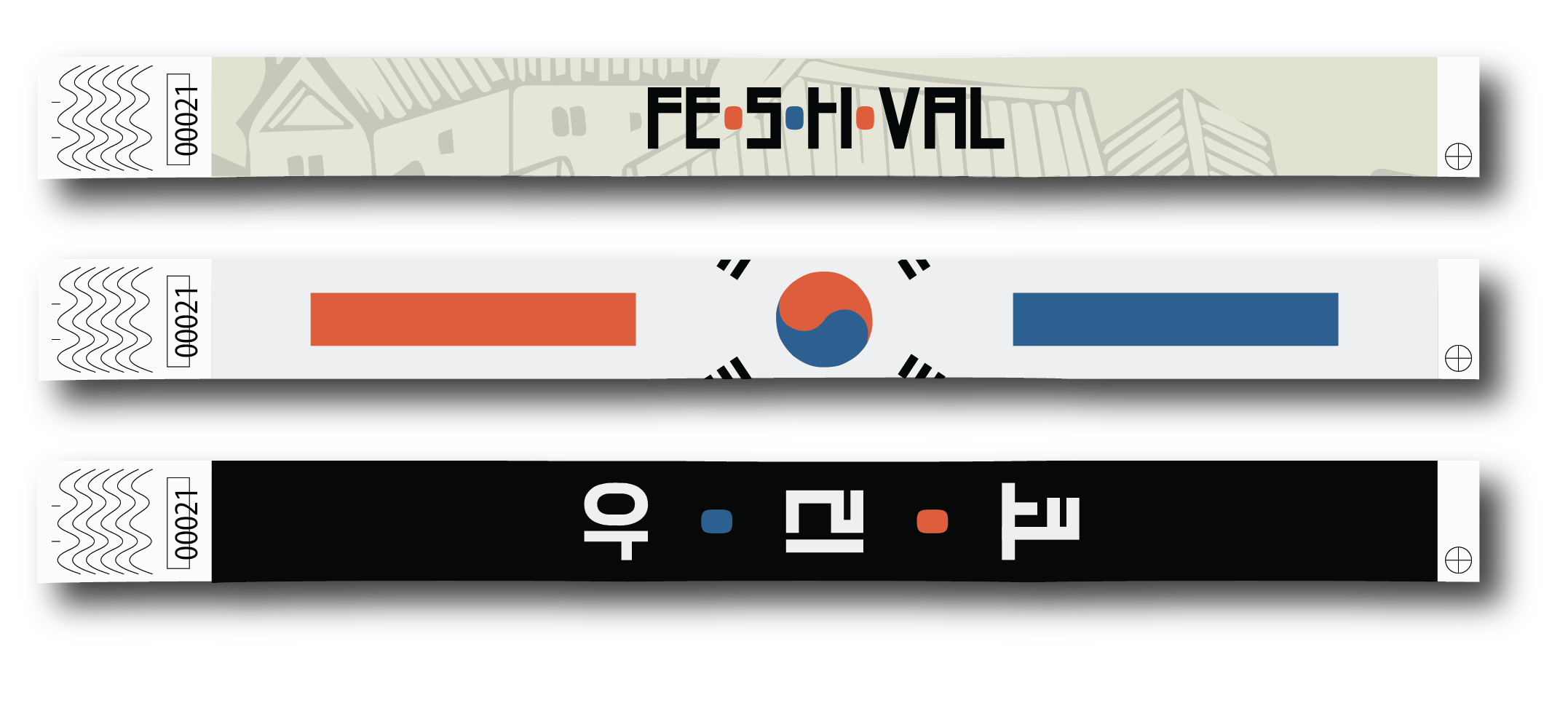
After carefully designing and finalizing the typeface, I came across old news about The Korean Festival in Houston, Texas. Annually in the fall in Downtown Houston, The Korean Festival happens by exposing people to Korean food, culture, concerts, traditions, and more!
This poster displays the letter arrangements from Hangul Sori and colors that directly remind of the Korean Flag. With all of these taken into consideration, the purpose of the poster is to present the event as direct, approachable, and genuine.


